‘Bad Role Models for Landscape Architecture’ is a series of articles I wrote in 2012 for Landscape online and which led to much discussion (some angry) and a short appearance on the BBC where I criticised Charles Jencks’s earthwork Northumberlandia. Jencks believes that in a postmodern age any publicity, even negative, is good publicity. This, however, is only a very temporary fact, and work made for this type of media response will itself be as ephemeral. All six instalments are reproduced unmodified from the original as a single piece.
Bad Role Models for Landscape Architecture
Many a landscape student’s bête noire is the concept – the ‘big idea’ that drives the design. Ultimately, any site’s big idea is its context and how that fits with its possible programme. Many design concepts actually prevent landscapes from functioning, and this series of short articles looks at a few of the ways projects can get off to false starts or come to bad ends.
Bad Concept Number 1: “The Inflexible Abstraction”
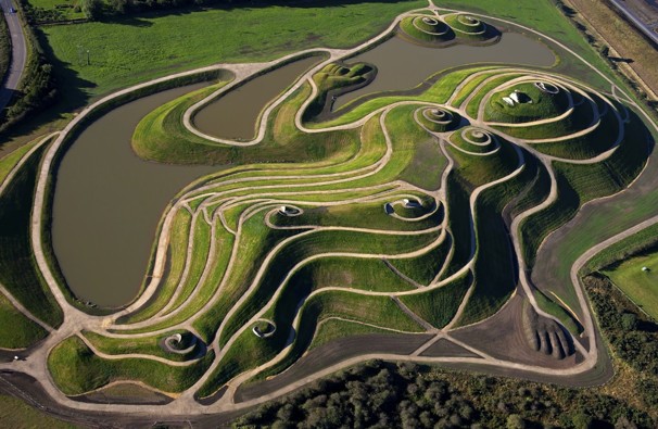
Northumberlandia, aerial view. From Strange History http://www.strangehistory.net/blog/wp-content/uploads/2013/01/northumberlandia.jpg
Gazing into the stars or pondering the philosophical ineffable can inspire us to try to express universal truths or fascinating theories about the nature of life or the stuff of the cosmos. This is a deeply human goal, but one that can go badly awry when applied literally to site design. Forms derived from speculations unrelated to site can die on the drafting table and then be delivered stiff and stillborn onto a site.
Charles Jencks is the current master of the inflexible abstraction and thus serves as our first bad role model for landscape architecture. Much work has been inspired by his curvaceous forms, which can be photogenic, but when students try to recreate his methods they find their designs are little more than cake-decorating across the surface of the site.
Indeed, this is usually what Jencks’s works do. His landforms strive towards a ‘universal iconography’ while expressing ‘local, national, and cosmic history’. This is accomplished by, for example, creating a pond in the shape of Scotland. The world is shrunk into a grain of sand as black holes commingle with quarks and Higgs’s bashful boson. Pages 20 and 21 of Jencks’ new book The Universe in the Landscape illustrate just how stiffly representational his work can be. A swirl of warped-grid paving curves into a massive concrete vortex. Visitors have been provided with a handrail so that they can resist the supergravity at the event horizon. Hang on tight!
Readers of Jencks’s new doorstop, should they be able to persevere beyond these initial pages, will be treated to a carnival of horrors, the most striking of which is an enormous landform in the shape of an earth goddess to be known as ‘Northumberlandia’, who, while not an actual local, national, or cosmic deity, is representative of one. She looks uncomfortable in her role. Northumberlandia’s hypertrophied breasts thrust into the sky while she lies in a twisted contraposto and raises a cold, dead hand in benediction. The icing on this particular piece of cake-decoration is that the artist saw fit to fashion an enormous mythic female form out of slag. Some day tourists will wave smugly from her hoar-frosted nipples.
A concept should give us a way of working with the landscape, not on the landscape. The projects illustrated in The Universe in the Landscape are models for concept-enslaved art imposed on the landscape, thus they are destructive models for landscape design.
Bad Concept Number 2: “All Soaped Up”

One World Trade Center. Image from Redesign Revolution http://www.redesignrevolution.com/wp-content/uploads/2012/06/One-World-Trade-Center-1.png
Sometimes the conceptual weakness in a design originates in the brief issued by the client, often when the goal is a “Garden of Something-or-other”. This could be ‘fellowship’ perhaps, or ‘remembrance’, or ‘earthly delights’. These are all meaningful appellations. They resonate with the public and the symbolic function of the language is fairly clear. They celebrate human ideals or human existence and they make these ideas tangible in a physical space that people can inhabit. These types of spaces have an important civic and cultural function for identity and belonging.
It can be difficult, though, to take such a far-reaching abstraction and apply it to generate form or to manipulate material on an actual site. These abstractions are as slippery as bars of soap. They just don’t afford any opportunities to get a grip
A spectacular example is Daniel Libeskind’s Ground Zero Master Plan for the World Trade Center site in Manhattan, the language of which is at once a haunted house of the ethereal and sacred, and a roundhouse punch of macho patriotic swagger. There are two key themes: one, ‘Reflecting Absence’, the twin fountains within the twin tower footprints and the ‘Freedom Tower’, the symbolic replacement for Minoru Yamasaki’s World Trade Center towers.
‘Reflecting Absence’, Michael Arad and Peter Walker’s fountains falter because they, in the manner of so many contemporary memorials, are immensely land-hungry. Since Maya Lin’s Vietnam War Memorial, every memorial must be narrative and immersive and big. Thus it gobbles up a lot of sacred land that could be used more usefully and very symbolically for the public exercise of democracy. Further, its fountains gobble up fossil fuels by pumping water at the rate of 98,000 litres a minute. This conspicuous waste combined with global tensions over fuel do nothing to improve the image of Americans in the world at large.
The pinnacle of the master plan is the ‘Freedom Tower’ (now the design of David Childs) and ‘freedom’ is used as both the conceptual and symbolic driver for the design. That anyone would want to utter the term ‘freedom’ after it was so wilfully perverted during the Bush years is remarkable, but Libeskind has given that perversion a patriotic erection 1,776 feet high (1776 being the year of the signing of the Declaration of Independence). For those many international dead from the twin towers, it is no comfort that this is, in metric, 541.3248 metres. Numerology is just another soapy, slippery notion.
Perhaps the important point for design, though, is that the concept of ‘freedom’ has burdened the world with yet another anodyne, air-conditioned, glassy, soap-slick stack.
Bad Concept Number 3: “The Killer Robot”
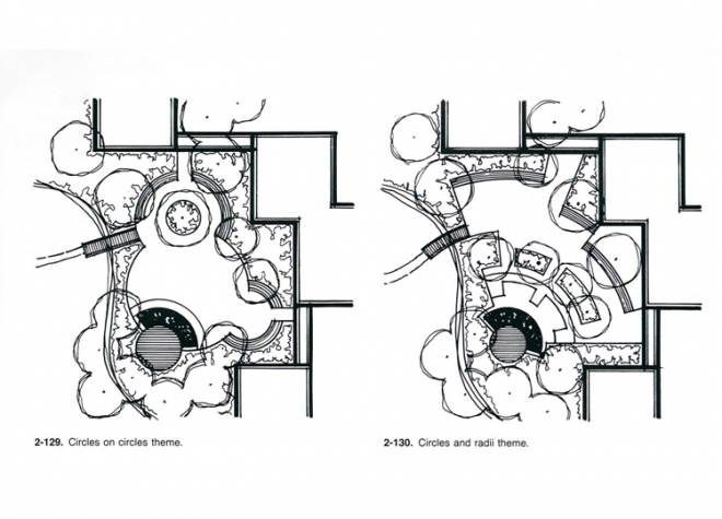
‘Circles on circles theme’ and 2-118 ‘Circles and radii theme’ from Grant Reid’s ‘From Concept to Form in Landscape Design’ (2nd Edition)
Wouldn’t it be wonderful if there was a simple formula for landscape design? Feed the site in as a variable (x marks the site), solve for x and, lo and behold, beyond the equals sign lurks a finished design. Actually, you’re probably thinking, it wouldn’t be wonderful. Landscape architects and garden designers would simply be out of work. Clients around the world could download the ‘garden design’ or ‘master plan’ app, and that would be that. Run app, print plan, hire contractor, job done.
On the Academy of Urbanism’s Linked In group, there have, at the time of this writing, been 106 earnest responses to the question “I am trying to develop a more systematic approach to assesing [sic] how well a place is doing …”, which shows just how much interest there is in the robotic, systematised approach to landscape. We know a simple formula doesn’t exist, but computerised modelling is still seen as a viable approach to landscape and urban practice, despite the egregious example of traffic planning’s universal failure to make better places anywhere through the use of very sexy and sophisticated models.
Models and formulas also demean our profession. The proliferation of short garden design courses based in a formulaic approach furthers the notion, dangerously amongst the general public, that a bit of careful shading with coloured pencil and the loving application of a bit of Euclidean geometry is all that’s required for place making. Landscape design: it’s just what you like, and just a bit of shrubbing it up. Child’s play. Why on earth would anyone spend eight years of their life working towards chartership just to do that? The prevalence of facile shape-making approaches in garden design has led a couple of generations of landscape architects to seek to distance themselves from gardens – a peculiar act that could be compared to denying the existence of your leg while you’re standing on it.
Not that this distancing has done much good. Formulaic approaches are writ large in a classic of the landscape architecture canon: Grant Reid’s From Concept to Form in Landscape Design. Reid has now assimilated thousands of landscape designers into a colony of killer robots, manufacturing mindless, soulless geometric designs across the face of the Earth. There’s no denying that it’s easy. Begin with a circle (or a hexagon, or even an irregular polygon), click and place it around in CAD a bit, and presto, a garden design that functions only in plan and which stylistically evokes the golden year of 1985. Landscape design, as good practitioners know, happens in four, and probably more dimensions, and we must engage all of our senses in design that is spatial. The 2D plan drawing is not truly our friend, at least not when used in isolation, and certainly not when geometry alone is the driver for site design.
Bad Concept Number 4: “The Thing”
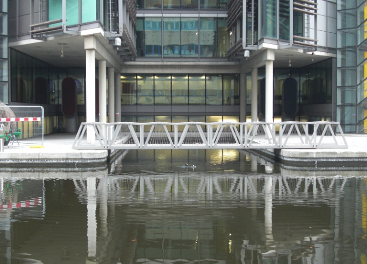
Heatherwick’s Rolling Bridge at Paddington Basin. Photo by Author.
A variety of factors, including the rampant economic growth around the turn of the millennium and the relentless drive towards branding that accompanied it, has led artists and designers of all stripes to seek continually to create the ‘iconic’ object. This is to some extent a noble ambition. It is possible to cast an eye back to globally significant examples such as the Wassily Chair, Tower Bridge, the Jaguar E-Type, Duchamp’s Fountain or Robert Capa’s Falling Soldier, to name a few, and to harbour some small ambition to duplicate that success. Naturally, many things will fall short of this significance, and that is a necessary evil. Many things become, in time, worthy of study as curiosities, aberrations, or bellwethers rather than icons. Damien Hirst’s For the Love of God or the revised Fiat Cinquecento might fit this category.
Icons, though, are rarely found in the work of landscape design. Landscape designers must beware of ‘the thing’: that object that appears fully formed on the drafting table and is then airlifted onto an unsuspecting site, where it becomes ‘plopitecture’. Worse yet, sometimes plopitecture necessitates a contortion of the site that appears posed and unnatural.
Thomas Heatherwick’s Rolling Bridge is one such egregious example. It is, in itself, a delightful thing. It is what all of our inner children want most: a clever and expensive toy. It sits across a small canal inlet that is grudgingly straddled by the hulk of Marks and Spencer’s HQ. Though Heatherwick Studio’s website is at pains to explain that the bridge lifts to allow access for a boat, a submerged concrete bulwark effectively obviates any such practice. And while one might imagine that such a clever and expensive portal might open to reveal a luxury stealth craft worthy of James Bond, the inlet is barely large enough to house a rubber dinghy. The awkward pose of it all renders the whole ensemble paltry, petty. One doesn’t want to play with either the toy or the box.
Roland Barthes, writing of photography in Camera Lucida, advances the theory that a photograph becomes effective through two means, the studium and the punctum. The studium might be seen as a sort of ground or setting, while the punctum (“that accident which pricks me …”) surprises and completes the image. The relation between sculptural objects or design elements and site might be thought of thus.
We should seek not to create icons, but rather, to use a good old-fashioned word, to create landmarks. A landmark is a punctum that is situated and that situates; it can make a place but it must necessarily be of that place and for that place as well.
Bad Concept Number 5: “The Gimmick”
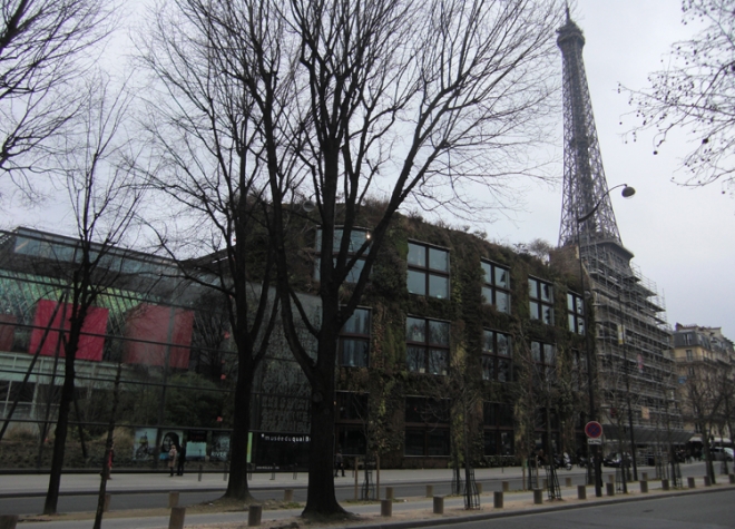
Musee du Quai Branly. Murky, unflattering photo supplied by author.
Our consumer culture continually reinforces obsessive neophilia. The next novelty, gadget, or technology is always enticingly within reach and there are whole realms of design in which obsolescence is a goal. There is a particularly loathsome breed of industrial designers, for example, who boast about the speed with which a product becomes obsolete and while still maintaining consumer confidence. Landscape architects are not immune to these forces, and often can design spaces that quickly become obsolete because they are dependent upon gimmickry and lack the ‘good bones’ necessary to endure beyond the life of the product. Failed lighting never fails to serve as a beacon of crapness, for example, particularly when the space is nothing but a vehicle for a spectacular lighting scheme.
Everyone likes a little flash and dazzle, though, and one designer who has cashed in on a gimmick is Patrick Blanc. With his green-dyed locks, leaf-print shirts, and long fingernails giving him a faintly reptilian air, he has stepped into the time-honoured role of ‘designer as exotic creature’. He clearly understands the theatre that is required for the job.
Blanc’s vertical gardens are the perfect combination of corporate bling and greenwash for clients who wish to project a literally and figuratively green image at the same time that they conspicuously display the ability to spend lavishly. No corporate campus food court is thus now complete without its own lush and dripping green wall.
There’s no doubt that people find these walls attractive. Last summer, Shelley Mosco designed a delightful Van Gogh styled vertical garden at the National Gallery that was nearly petted to death by adoring tourists and may have been the most photographed London attraction of the season. It’s only a matter of time, though, before the craze is over. Once the irrigation systems stop working those green façades will disappear, or, perhaps more appropriately they’ll just be planted up with ivy. Maybe, though, we will finally have accomplished the feat of convincing architects that vine-clad buildings can be lovely.
It isn’t that the gimmick isn’t important – it is – just as important as those Le Corbusier specs for giving the client the full experience of hiring a designer. These things, though, are just the trappings, which are prone to obsolescence. The underlying design must always be robust enough to remain beautiful and functional when the gimmick is gone.
Part 6: “Is There a Good Concept?”

Design studio desk, early 21st Century, Rhode Island School of Design. Photo by author.
A large part of imagination is simulation. The design process can be thought of as a sophisticated ‘flight simulator’ that allows the testing of a design in motion before it takes form on site. A flight simulator saves lives, money, and materials by allowing novice pilots to err virtually – and this is precisely also true of design process. What of the art in design, though? A pilot learns skills that are analytical, instrumental, mechanical, whereas design must also be emotive, sensual, perhaps even mythic (and one wouldn’t want to be on a flight with those qualities). Is the concept the art component of design? Is design like a simulator run on the electricity of the idea? In a word, no. We need to reframe our idea of the idea in landscape design.
What is your concept?
This is the question that is asked in critiques, the question students and professionals ask each other, and it’s even the question clients have been trained to ask. The concept, though, as it is commonly wielded, possesses a monolithic singularity. Once formed, the concept can be unassailable. Mitigating factors and contingencies must be cast off or repelled. The concept becomes so abstracted from the site that communication between genius loci and concept is simply lost. The virtual aeroplane keeps landing on the same runway, same time, same crosswind, same stale coffee.
Where is the rupture? Why do concept-based approaches for design genesis fail? First, because they tend to be uncritical. Concept may follow analysis, but the crucial work of interpretation is missing. Second, because it is a human trait to seek abstractions that transcend the physical – often as pure, universal ‘truths’ – fixed and timeless, axiomatic. Concepts thus formed become so literal that they bear no relation to place. These two related tendencies result in art that more resembles taxidermy than living, breathing nature.
If not concept, then what?
We might begin to found a new idea of landscape design process by first examining the medium. It’s a truism, for example, to say that a potter thinks differently from a carpenter, that the medium of clay creates a particularly plastic mode of understanding, whereas wood has pliancy but requires precision, as does the woodworker. One might even, as an extreme example, examine Zen philosophy through the lens of the art of motorcycle maintenance. Our bodily experience of the world and our interaction with its materials shapes our life views and our modes of knowledge.
To examine medium in landscape design is particularly complex. First, there are the various media employed in drawing and modelling during the creative simulation phase of design that occurs in primarily in the studio. This plurality of materials marks a particular landscape architectural way of knowing that is distinct from the work of the specialist craftsman. Second, there is landscape itself, which really can’t be considered a singular medium at all, but rather must be viewed as a set of processes and forces – ecological, geological, political, social, cultural – that are constantly dynamic and interpenetrating.
The answer is, again, in our idea of the ‘big idea’ of design. If we conceive of both site and of design processes as fluid and relational, then we must begin to work and act in more fluid and relational ways. It is not a question of eliminating concept in favour of context. Context must be engaged through inaugurating a process of active, open-ended conceptualising in design as opposed to a fixed concept. This may seem like a subtle shift, but it is one that could not only utterly redefine our work with landscape, but redefine design processes across the architectures, arts and manufactures. As we seek more sustainable and resilient modes of thinking and practice, the scope of contemporary landscape architecture demands that we lead the way.

![Peter Paul Rubens, Abundantia, c. 1630 [Public domain or Public domain], via Wikimedia Commons](http://www.tim-waterman.co.uk/wp-content/uploads/2015/03/Peter_Paul_Rubens_-_Abundance_Abundantia_-_Google_Art_Project.jpg)

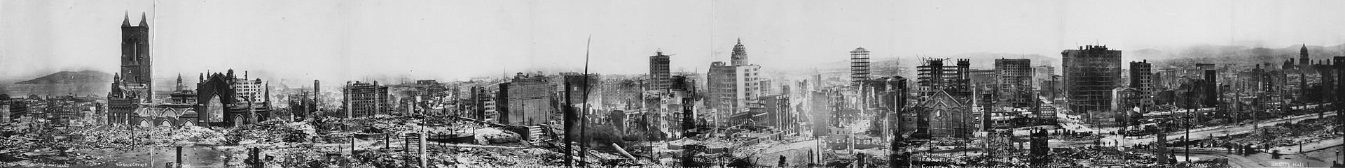
![George R. Lawrence, 1908: "San Francisco in ruins from Lawrence Captive Airship – 2000 feet [660 m] above San Francisco Bay – Overlooking waterfront. – Sunset over Golden Gate." Market Street leads directly away from Ferry Building tower, center foreground.](http://www.tim-waterman.co.uk/wp-content/uploads/2014/12/San_Francisco_in_ruin_edit2.jpg)