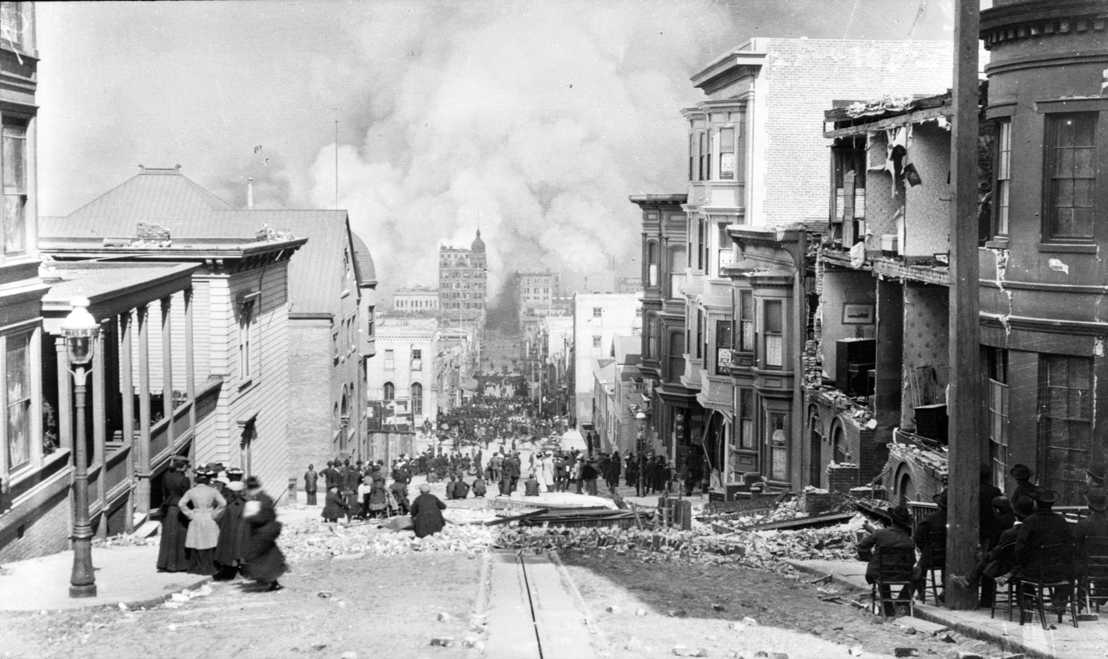
San Francisco fire after the 1906 earthquake, Sacramento Street, image by Arnold Genthe
This is an unpublished essay I wrote in 2003. I have made some small changes for accuracy, but I have left my writing style of the time intact. I’m every bit as fond of Stadler’s book now as I was then.
Literature provides a unique vehicle for the interpretation of landscapes, adding numerous senses to the experience described; a departure from standard non-fiction on the topic, which primarily concerns itself with the landscape as apprehended visually. The multi-sensory approach proves, if not more objective, a more faithful rendering of the way the individual experiences the environment. Further, it can help to point up the types of detail the subjective observer is drawn to, which could provide cues for design.
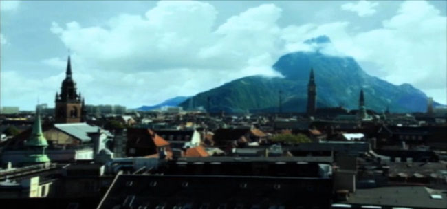
Matthew Stadler’s 1990 novel Landscape: Memory is an unusual, intelligent, and chatty coming-of-age novel set in San Francisco in the early twentieth century. Its setting, its lyrical use of the English language, and its precise detailing of the landscape of the time sets it apart from the average bildungsroman and makes it a most apt subject for the study of cultural geography and landscape. The novel also encompasses a wide range of landscapes, ranging from rural, pastoral, and seaside settings in Bolinas to bustling downtown San Francisco to the wedding-cake fantasy of the 1915 Panama Pacific World’s Fair; as well as a subplot located in the trenches of Belgium. The accelerating progress of the twentieth century is increasingly felt, but San Francisco has yet to explosively expand from its busy core into the surrounding countryside. Construction of the Fair may be viewed from the forest on the bluffs above, which are as yet unsullied by suburban homes.
The novel is narrated by its protagonist, Max Kosegarten, who while an astute observer, is prone to revery and flights of fancy. The narrative relates the story of his adolescence, punctuated with drawing lessons from Ruskin, ornithological excursions with his father, motoring with his anarchist friend Flora, the adulterous affair of his mother with his best friend’s father, and the budding romance between he and his best friend, Duncan. The story takes place in 1914 and 1915, during the building and opening of the World’s Fair, and with details of the great earthquake and fire of 1906 referred to in flashbacks. It’s appropriate that a coming-of-age story should be set at a time when San Francisco was experiencing the same sorts of growing pains; moving from urban adolescence to the full bloom of a world city.
The motion of the novel’s narrative is carried quite strongly by its physical movement through the landscape; each shift in voice, context, or plot is accompanied by a new setting that is lovingly described. The first pages set up the action with a description of the daredevil aviator Lincoln Beachey soaring above the Presidio in his fragile plane:
The wind is salty and cold in his nostrils, ripping in off the gray-green sea. It drags up the face of Mount Tam carrying sea birds who glide on its lift and pull, and birdmen, like Beachey, daring enough to take the free ride up on treacherous winds. This whole place is spread out wide below him. The yellow-blue waters of the bay, lying flat up to the lip of the land, the hills rising green, then brown and burned golden across the high ridges rolling on east and forever.
Imagine him south now. He’s come over the city, over the open green fields and thick woods of the Presidio, … down over Sunset and the dunes, south to the open hills running wild by the coast, thick fog pressing in on their western face. It’s rolling over the ridges and down into valleys, lying low and silent on the lakes.
The dunes, the waves, and the colours all seem to flash by in much the way an aviator must have seen them. This sets up both the overall context of the landscape in the book, and establishes the dream-like quality of San Francisco seen by a boy prone to flights of fancy. It also places the reader in time, with the visceral experience of flying in an early biplane, and the notable lack of development surrounding the city.
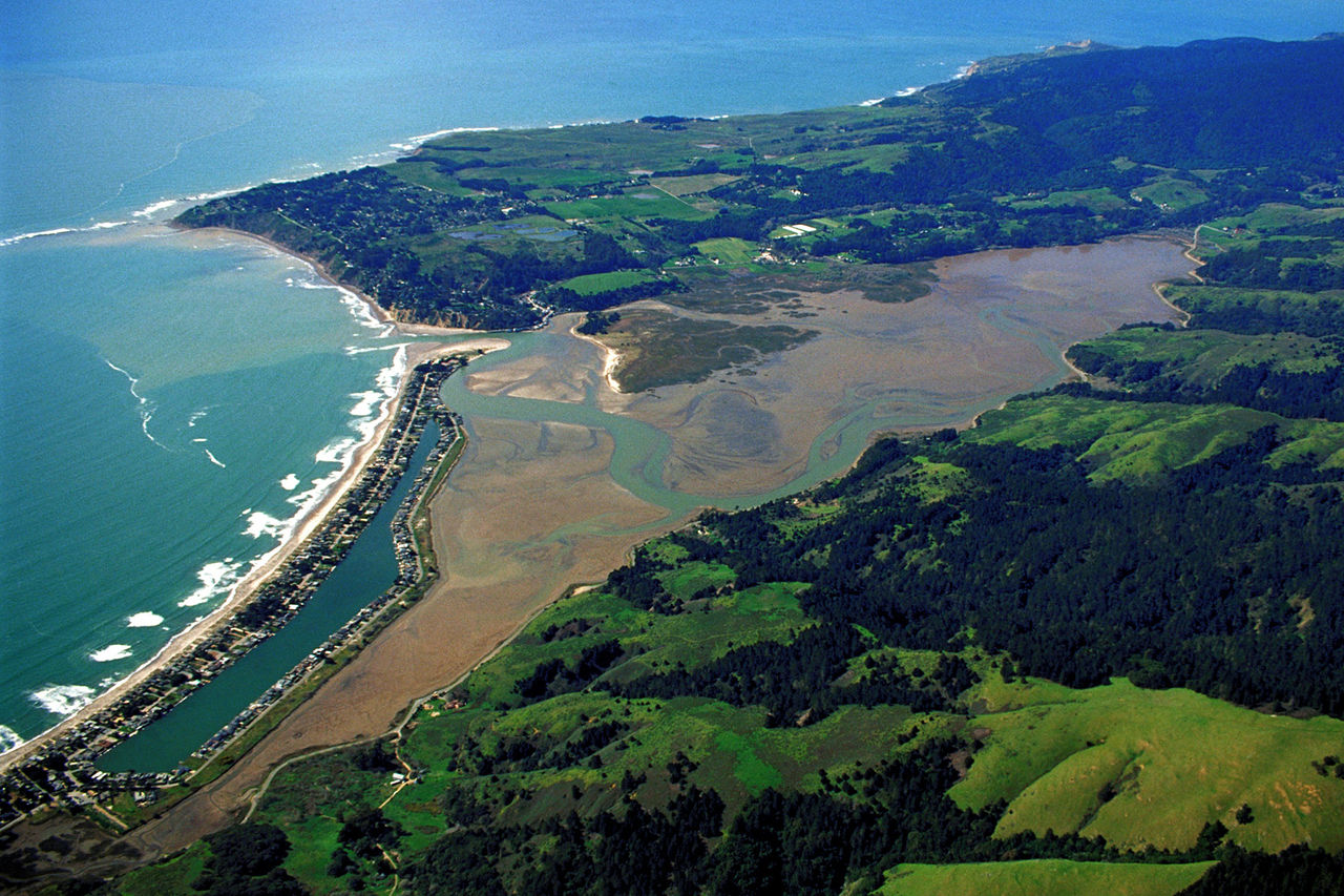
Aerial view of Bolinas Lagoon and peninsula, the setting for parts of Landscape: Memory. Image Army Corps of Engineers
The narrative soon becomes more intimate, as Max and his friend Duncan explore the hills and gullies above Bolinas Lagoon, northwest along the coast from San Francisco.
We found a ruin to the south and back down into the thick woods of Weeks Gulch. Small and overgrown, barely one square room of tumbled-down stones, but a ruin nonetheless. It stood on a small rise up the north side of the gulch, peeling madronas bent high over the rough, crumbling walls. The view west opened up through the tops of redwoods growing from deep in the ravine. The hot sun had burned down all day on their broad green branches so the air was sweet and dry. The lagoon stretched out flat for miles, its lip lying on a muddy strip of land down beyond the mouth of the gully.
Once again, the semi-wild character of San Francisco’s outskirts is described, and this time with attention to the other senses. The feel of the air and the sun, and the scent of redwoods are strongly evoked. Later in the day, Max and Duncan have set up camp, and he notes, “only the loons remain with us, still and perfect, floating in the absolute calm. Their small bodies bob in the strange dusk. They slip across the water. And their long, lowing song fills me, as full and enveloping as the sweet, cool evening.” Here the loons and their calls, and their gentle motion on the still water once again show the landscape animated. The progression from the hot sun of the day to the cool evening also illustrates beautifully the cycle of the day, that carries us from sleepy morning to the activity of the day, then again to sleepy evening. It is important to remember that our perception of our environment is experienced through the filter of our senses, which are differently tuned through the day, even as the sun casts a different light at different hours, and night has its own illuminations to which our diurnal character responds with a most pleasant lethargy.
![George R. Lawrence, 1908: "San Francisco in ruins from Lawrence Captive Airship – 2000 feet [660 m] above San Francisco Bay – Overlooking waterfront. – Sunset over Golden Gate." Market Street leads directly away from Ferry Building tower, center foreground.](http://www.tim-waterman.co.uk/wp-content/uploads/2014/12/San_Francisco_in_ruin_edit2.jpg)
George R. Lawrence, 1908: “San Francisco in ruins from Lawrence Captive Airship – 2000 feet [660 m] above San Francisco Bay – Overlooking waterfront. – Sunset over Golden Gate.” Market Street leads directly away from Ferry Building tower, center foreground.
The metropolis exerts a completely different influence on the person than do the woods and fields. The delirium of constant activity, the blaze of lights at night, the jumble of cars (and in the novel’s era, of horses and carts), the hucksters, the hooligans, and the finely adorned; all of this works to confuse us, as they work against our natural cycles. Far from unpleasant, though, the city is like a drug; distorting our perceptions, attenuating the focus as at once one is saturated with the peripheral. Max writes;
We parked down by Stockton, in the midst of the busiest jumble. Trolleys clanged past four abreast. Horses and carts and cars and bicyclists wiggled in amongst the mayhem. It seemed some disaster had struck,, some terrible trembling from deep in the earth and this was the ensuing panic.
Ladies bustled into traffic, navigating boldly through the various conveyances, stopping to converse on thin islands of safety between lanes of traffic. One raised her little gloved hand and a jitney jammed its brakes and skidded to a stop nearby. Other cars swerved out behind into the trolley paths.
Earlier in the text he says, “The buildings seemed so incredibly tall, rising up on either side of Post like sheer canyon walls …. The inhuman speed and noise of the motorcar rattled through me. It worked inside me so I wanted to either sleep or throw up, the two seeming equally viable and, somehow, quite familiar.” We see the fascination in the clangor of the city and how its hubbub works upon the senses and emotions so that they become as cacophonous as the world around. In the latter quote we see, too, that this effect is simultaneously upsetting and calming; paradoxical, perhaps, but all too true, especially for those able to recall their first experience in the city.
The city’s hallucinogenic effect is yet magnified in times of crisis. In a flashback to his early childhood, Max recalls the catastrophic earthquake of 1906;
Nothing was familiar anymore. All up and down the street the houses were broken, fences fallen. I could see through places where before I couldn’t. Yards disappeared under rubble and the street did too, all tangled and blocked. Some places were big holes like one near me with metal pipes poking out into air and a horse’s head I could see reaching up out from the rim, wild-eyed, baring its teeth and foaming. It was on its side, fallen against the dirty wall of the hole, not using its legs right.
I walked away back into the play dunes where everything still looked okay and it was quieter if I got far enough in. I stayed there for a while. I couldn’t think much about things.

Sunken houses on Howard Street in 1906. Image from stereoscopic card.
These phrases remind us that beneath the veneer of order lurks the possibility for disaster that exists in any landscape. While it may be unsettling to ponder this, it highlights the preciousness of the accustomed view with the intimation that it precariousness necessitates greater appreciation. This sensation is never more apparent than during a crisis, or most especially in times of war when we ourselves are the catastrophe being visited upon the land.
The Great War was in full swing during the time in which this novel is set, and reminders of it come in the novel in the form of letters from Max’s Uncle Maury, an English doctor and soldier in the trenches of Flanders. Throughout the book, the letters become more and more dour, until finally Maury describes curling up and succumbing to the numbness of the horror of war. He describes the landscape outside the trenches when he is assigned to scavenge salvage during a brief reprieve from the exchange of fire:
From a distance it looked plain enough, a sea of mud pocked by craters … There are no trees here, any longer, no shrubs or ground cover, no grass or wheat or rye, nothing. Good land is solid and the rest is mud, sometimes waist-deep and impossible to tell until you’re right in it. We’d been issued rakes and ropes for our operation. You can imagine the first find, my rake dragging into something heavy but manageable, the boot end coming up first and then it popping clean from the sucking mud just above the knee where it had been severed. One can be so willingly blind until slapped in the face, and then be blind again.

No Man’s Land, Flanders, 1919. Photo by W. L. King, Millersberg, Ohio; by courtesy of Military Intelligence Div., General Staff, U.S. Army.
Just as young Max witnessed the tearing apart of the earth during the earthquake in San Francisco, so his Uncle Maury is witness to the terror that can dwell just below the surface; literally, in both cases, though the figurative meaning is not far behind. Even in the midst of such terror, however, our trust in the power of the land to heal itself is manifest. Maury writes, “What sorts of birds should one expect with spring here? I find myself wondering about the reality this place once was. I don’t recognize it as land really … Perhaps the war’s a wound that will heal with the weather and the seasons.” Interestingly, I just traveled to Western Flanders near Diksmuide this winter, and even though the trees are grown and the fields are green and lush now, the spectre of the horror of war still hangs over the land in a most palpable way. As the title of the book suggests, memory is as distinct a part of the landscape as are the immediate senses. It makes the verdure seem but a thin pretense, a hasty excuse for the history buried in the soil.
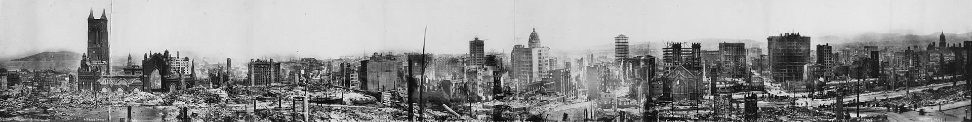
San Francisco panorama after the earthquake of 1906. Lester C. Guernsey – Photo by Lester C. Guernsey Via Library of Congress Panoramic collection
Opposite to the novel’s approach to the war those thousands of miles away is its focus on the euphoric, exalted landscape of fantasy that was the Panama-Pacific World’s Fair. Though marred by wartime boycotts, it was still very well attended, and was celebrated for its ‘Tower of Jewels,’ its ‘Palace of Fine Arts,’ its many hundreds of sculptures, and its dazzling display of ‘Scintillator’ lights.
The Fair opened up below, rising like a fantastic dream of the Orient, all golden, pink, red, orange and blue. The domes looked more unimaginably grand than ever they’d seemed from land. Thin pillars and minarets, the Tower of Jewels, like liquid silver, washed in the sun—from the Presidio clear across to the marina, they rose, sparkling in the brisk salty air.
This is Max’s impression of the Fair as viewed from the ferry in the bay. Like the urban experience, and like the war experience, the Fair is larger-than-life, other-worldly, and hallucinogenic. This was a landscape of dreams, of the greatest aspirations of human imagining, and just like a dream it was insubstantial. The great buildings and colonnades were mere wood and lath and plaster, painted to mimic the massiveness of stone; the sculptures were wire and Plaster-of-Paris, and most would be engulfed in fire and destroyed that same year. The many tons of fill, trucked into the wetlands, that it took to build it upon, would liquefy in the next earthquake, carrying away what remained in one convulsive heave.
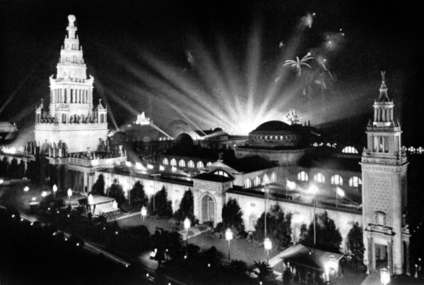
Panama-Pacific International Exposition. The Tower of Jewels is to the left, with the Scintillator lights behind. The Italian Tower is to the right. – Project Gutenberg eText 17625
It was easy to see past the ruse while at the Fair. Max illustrates the point in this passage:
If you flew by overhead, say in a Zeppelin, you’d see an impressive city of domes, gargantuan in aspect and harmonious in coloring. The festive avenues are lined with full-grown palm and eucalyptus. The Palace of Fine Arts is swathed in creeping vines and bordered by the finished lagoon, looking like it’s been there a thousand years. You might land to the northeast, where the aeroplanes land, or come in by yacht, docking at the marina. Perhaps you’ll just drop from the sky, piercing the thin plaster of the Dome of the Ages, breaking your limbs and revealing the flimsy wood lathing that supports these impostors.
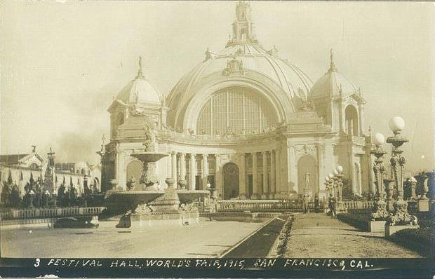
The Festival Hall at the Pan Pacific World’s Fair from an unmailed postcard
It was easier to participate in the suspension of disbelief at night, when the Scintilators played their “curtains of color across the black sky above the bay,” the drunken revelers in the Zone would be reeling around, and music and gaiety everywhere suffused the atmosphere. Then it would be as if one had been transported magically to a place where the glorious past and the tantalizing future had merged into one delightful confection; hope, memory, and the whirl of the present fused together mystically and maniacally. Max writes of the Fair at night, walking down the Avenue of Progress toward the water that, “Bright banners hung high the whole length of the avenue, beating about in the wind, casting shadows into stray clouds of steam. They looked like lurid poppies floating in a black pool, all poked and pushed by drunken fish, jumping around there in the night. I got to feeling dizzy, what with the long avenue leading off into infinity and the sky displaced by so many colors.”
Matthew Stadler’s Landscape: Memory would surely benefit from a more thorough analysis. I have failed to touch on themes from Ruskin that surface throughout the book and further inform the narrative and the understanding of the landscape. There are many more than passing mentions of the feel of the sea breeze, the wheeling of gulls, the sensation of dewy grass against the calves, and of course the whole gay erotic subtext of the book that informs an entirely different sort of landscape—that of desire. I have, however, attempted to show the power that landscape has for the knitting together of narrative and setting and its capacity for establishing and enabling theme. I have also tried to show that literature is an excellent reference to the subjective experience of landscape; that to ignore the ever-shifting and multi-sensory aspects of it as exposed by writers is to miss the greatest opportunity for designers of the landscape—mastering the evanescent qualities of plants, sky, sun and moon, and the ephemeral motion of people and animals through them.

![Peter Paul Rubens, Abundantia, c. 1630 [Public domain or Public domain], via Wikimedia Commons](http://www.tim-waterman.co.uk/wp-content/uploads/2015/03/Peter_Paul_Rubens_-_Abundance_Abundantia_-_Google_Art_Project.jpg)